
Food Truck City Map Case Study
Overview
In this case study we are going to attempt to explain the development of the Food Truck City Map website, its problems and its features. The Food Truck City Map concept hopes to be a seamless, quick and user-friendly experience for people who regularly eat at food trucks and a way for Food Truck owners to access a larger pool of possible customers.
Problem Statement
In order to assist the residents of cities with access to food trucks we have developed a website that contains various important factors
- Ensure that any user can access contact information for a food truck.
- Ensure that any user who wants to be a member can log-in or sign-up
- Ensure that any food truck owner who wants to update their food truck city map can register
- Ensure that any user can see the events page
- Allow riders to select one of many food categories and see a list of food trucks with a filtering option and tags.
- Ensure that any user can start a catering application
- Ensure that any can see the menu, review section and photo gallery for each specific food truck
- Ensure that food truck owners can update their menu, location and hours.
These main questions were the primary focus of this project, and as such we will attempt to answer them for the users of our app.
Users and Audience
The product is meant to be used by anyone who enjoys eating out at food trucks or owns a food truck that serves a community. A variety of three user personas were created. The first user persona was based on a local blogger who visits local eateries. The second persona was an individual who works at a corporate office near a food truck. The third person was based on an individual who works as a truck driver and only frequents food trucks during the weekends he’s home.
Roles and Responsibilities
The sketching, designing, planning, and wireframing has been created by me. The prototyping was helped by my partner Megan Newell who volunteered as a the first usability test of the prototype. The feedback of the mentors at Thinkful has been invaluable. Other people who have helped in this project is my business owner Juan R. The usability test feedback he provided gave major insight about our website.
Scope and Constraints
The only constraint so far was the lack of user testing due to timing and other issues (like lack of desktop access). The scope of the project was only created to make note of the important areas of the project and the best possible layout. A finished product would include a larger pool of food trucks.
Process
Discover
Name and project planning
The naming process was minimal. We decided to stick with Food Truck City Map because it was the most concise way of showcasing the product being sold. The concept however can be changed to any other names and most of the rest of the project would not change.
User Survey
Initially a user survey was created in which we asked a series of questions based on using digital apps and usage of food trucks, as well as the reason and causes for this. From this user survey, we created three user surveys and six user stories which were used through the course of the project.

Competitor Review
We developed a competitor analysis through the SWOT mechanism which allowed us to take a closer look at the competitors and figure out what was missing from each individual competitor and what else could be added to assist the typical user.
The following are websites of the competitors we evaluated during this stage of the design process:
- Does not have a focus on social activity

- No map
- Information is not up to date. Most if not trucks are missing. However the information is still there

- Does not specify for food trucks. Some information is very old.

- UI is very old and clanky. Way too much information on one page.

Define
User Story
TJ Gardner has beeen a photographer for many years in Iowa. Due to lack of work because of the pandemic the past year he developed his own website and blog. The blog has been successful and has brought large amounts of traffic to his website, where he sells his prints and other goodies. His blog consists of small business around Des Moines and his experiences when engaging with them.
- TJ wants to take photos of the food he eats from food trucks to gain engagement from followers
- TJ wants to have a gallery of his photos so that other people can enjoy his artwork

Isabella Hunter is from a small town in Nebraska and moved to Ankeny to work at a job at Principal in Des Moines, 30 minutes away from her home. She has been working at this company for about a decade and has good relationships with co-workers. A couple months ago she was invited to have lunch with one of her friends and another co-worker and they have since gone to eat together at the food truck down the street from her building.
- Isabella wants to know where her favorite food truck will be at its usual location this week.
- Isabella wants to see what other people think of her favorite food truck

James Willen has lived in Des Moines his whole life. A few years ago he received his CDL and started a job working as a truck driver. He has since been to many places around the United States but his family and home are in Des Moines. When he comes home he likes to eat at his favorite food trucks and restaurants and at night he enjoys going to the bars downtown.
- James wants to help his food truck owner friend set up his food truck owner account
- James wants to see the menu for a food truck he plans to visit during the weekend.

User Flow
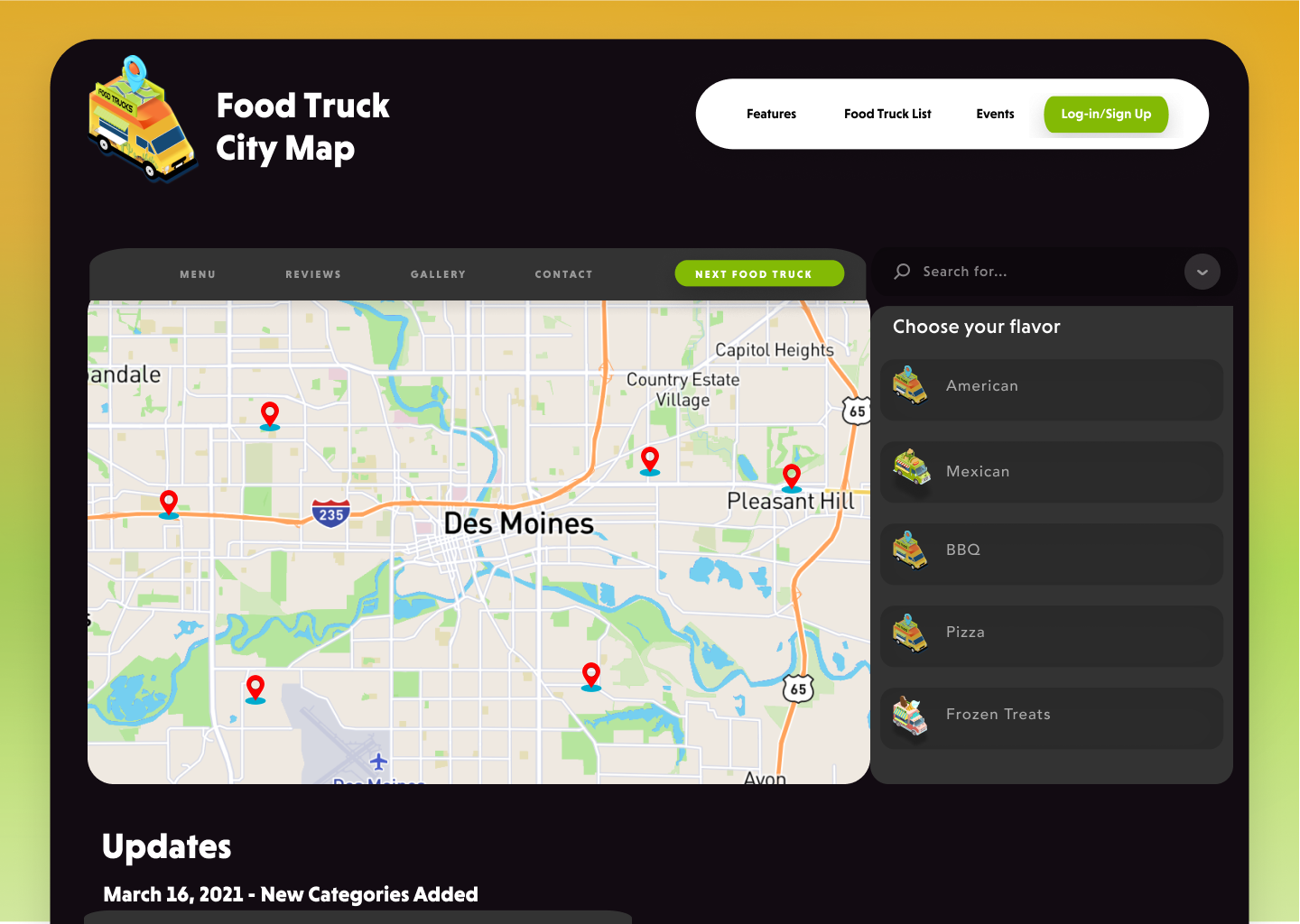
The most important idea behind the first user flow was to create easy to access points that would make it easy for a first-time user to access all the required information. The main screen would have a navigation bar for the page and a navigation bar for the map. At this point it was decided that the navigation bar should contain Events, About Us and a Features page which would contain Catering and a social media game.

Information Architecture
At this stage we created a sitemap using Lucidchart in which we figured the amount of pages that would be required at minimum in order to solve the problem statements of the project. After that we wrote out every single part of the text that would be included in the wireframe.
.png)
Hand Sketches
At this stage of the design-making process we drew a sketch of a couple pages in order to bring about ideas of how the lofi wireframes might look like and in order to find similar elements that we could adapt to multiple pages.

Lo-fi Wireframes
During this stage we used figma to create lo-fi wireframes as the basework of the later stages. During this process we created all the possible pages, navigation bars and placement of menus. We tried to make it so that most content fits neatly into two columns so that when used in a mobile version it could easily blend into a phone’s vertical design seamlessly.
At this stage it was decided to keep a navigation bar when using the map and making the main navigation bar available in all pages.
n the homepage we made the log-in button the most visible in order to attract customers to make an account and engage with the website. Clicking on that button leads to a page that gives the user the option to log-in with a pre-existing account or social media buttons and a separate section that gives the user the option to register and a short description.
Clicking on the features tab will open a page that gives you the option to select between Catering and a Photo Game. At the bottom it will also have a frequently asked questions section


Develop
Mood Board
During this stage we opted for three main colors as well as a very light black and a dim dark white for the text and backgrounds. The colors that attracted attention were a fresh green (#B2DC56) and a soft orange (#EBB531) these were initially used to create a sense of freshness and healthiness and a sense of friendliness and availability respectively. A darker shade of blue (#4C5B82) to contrast the other colors was chosen to finish the project’s color palette.

Logo
Using illustrator stripped everything off an isometric version of a taco food truck vector found on the web and replaced it with what the Food Truck City Map website was selling: location. We replaced the taco on top of the food truck with an isometric GPS symbol and map. We replaced the words on the trucks from Tacos to Food Trucks. We changed the colors to match the branding of the project.

Typography
We selected two modern san serif fonts for this project
- Headings: Niveau Grotesk
- Paragraph: Soleil
High-Fidelity Wireframes
A copy of the lo-fi wireframes was created and complemented with a style guide that included the color scheme and a variety of gradients as well as the typography that was to be used and the sizes of the headings and text.


Deliver
Usability Test
We developed a usability test in order to test the efficacy of the website and to make sure the problems presented during the problem statement are properly answered
Scope
During the course of this usability test we will conduct a series of experiments on willing participants for a Food Truck City Map website
- The prototype for the Food Truck City Map website was finished on March 23rd and the Usability Test will be conducted over the course of one day on March 24th.
- The current prototype is designed to fit a desktop screen.
Purpose
The primary purpose of this usability test is to determine if a user can get to the page and solve seven main problems based on the problem statement at the beginning of the project:
- Ensure that any user who wants to be a member can log-in or sign-up
- Ensure that any food truck owner who wants to update their food truck city map can register
- Ensure that any user can see the events page
- Allow users to select one of many food categories and see a list of food trucks with a filtering option and tags.
- Ensure that any user can start a catering application
- Ensure that any can see the menu, review section and photo gallery for each specific food truck
- Ensure that food truck owners can update their menu, location and hours.
Schedule & Location
- We will be conducting the test at my home on March 23 and 24th at my home and at one of the participants office location
Session & Equipment
- The sessions for each participant will last approximately 30 minutes.
- There will only be one session per participant
- Google Docs
- Figma Macbook App
- Paper & Pencil
- Chronometer
- Voice Recorder
Participants
- Megan Newell, partner, 28 years old.
- Juan R, business owner, 48 years old.
Usability Report
Summary
- Participants agree on first task being easy to finish
- Participants struggled finding this page but were made aware of the lack of capabilities on a prototype
- Participants agreed that events was accessible
- Participants were immediately able to find the food truck list
- Participants were quick to click on features.
- Participants easily found the menu
- One participant was not able to find the gallery at first because they navigated through other pages but I attribute this to the user just wanting to see more pages.
- Participants found the log-in button and member button easy to find.
Outcomes
At the end of each usability test, we asked participants four more questions as an ending to the test.
These were the questions:
Which parts of this page are most or least important to you?
- One participant said the gallery is the most important because sometimes if he doesn’t know what the food looks like he won’t eat it. The other participant said the home page.
What do you like or dislike about this?
- Both participants thought the log-in button to appear bigger than what it is or emphasize more
If you had three wishes to make this app better what would they be?
- One participant said they wished they could contact who made the page, so an About Us section was added to the final prototype.

Conclusion
At the end of this test we have concluded that the pages created for this website have been sufficient in order to finish the tasks provided, and with this foundation we can build a website that is more user-friendly than the current websites that help users find food trucks available online. However, more testing with a larger audience may still be required.
Another conclusion of the usability test goes back to a personal hypothesis of my own, that the simpler a device of technology is the more likely people will use it over competitors.
Delivering Assets
After having finished and developed the final mockups, I have separated each element, every icon and each button and placed them in labeled folders. This will make it easier for the developer to add this information to the app in a seamless, organized fashion.
1. The collection of pages has been exported as JPG.
2. The collection of other elements has been exported as PNG.
Next Steps
We hope to put this plan in development in the near future, hopefully by securing some funding from a local organization we can make this dream a reality and bring the Food Truck City Map concept to users in many communities across the US.

